Case Study: Palantir Metropolis UX
In 2004, Palantir was founded on the idea that data at scale could be used to help human analysts make better decisions, particularly in the area of counter-intelligence. Their first product, Palantir (Government) Gotham, was a data analysis tool that could take in huge amounts of disparate forms of data and help make sense of that data. I joined the Palantir (Finance) Metropolis Product Team in 2007, a new and separate team formed with similar ideals about data and analysis, but for the realm of Finance. The team consisted of less than 15 members and I was the first designer to work on the product.

Goals & Objectives
By 2007, data was becoming massively abundant everywhere, essentially a commodity. However, there were no modern software tools to help analyze data at this new scale. Palantir’s mission was to help answer hard questions using this generation of newly available data. While the Gotham team tackled the intel space, my team’s objective was to transform the finance space. Our goal was to build modern user-centered enterprise software that integrated large scales of data for finance analysts in large banking institutions, hedge funds, financial services firms, and academic institutions studying finance and economics.
Audience & Research
By researching the workflow of traders and analysts on Wall Street, research universities, and hedge funds, my team found that they were using antiquated systems that were built in the 80s. They were constantly importing and exporting data sets between complex and varied tools like Bloomberg Terminal, MatLab, FactSet, Microsoft Excel, etc. In 2007, these tools had clunky and outdated GUIs. After all, Wall Street had no reason to improve software or a workflow that consistently minted money. Many analysts had multiple monitor setups where they could have one with a dashboard monitoring portfolios, watchlists, news, and indexes. This helped drive the design as applications that could run on multiple screens during the user’s workflow.
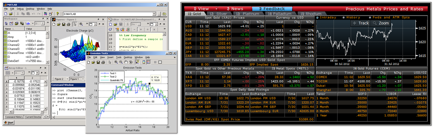
(MatLab and Bloomberg Terminal)
Here are some initial workflows that were observed:
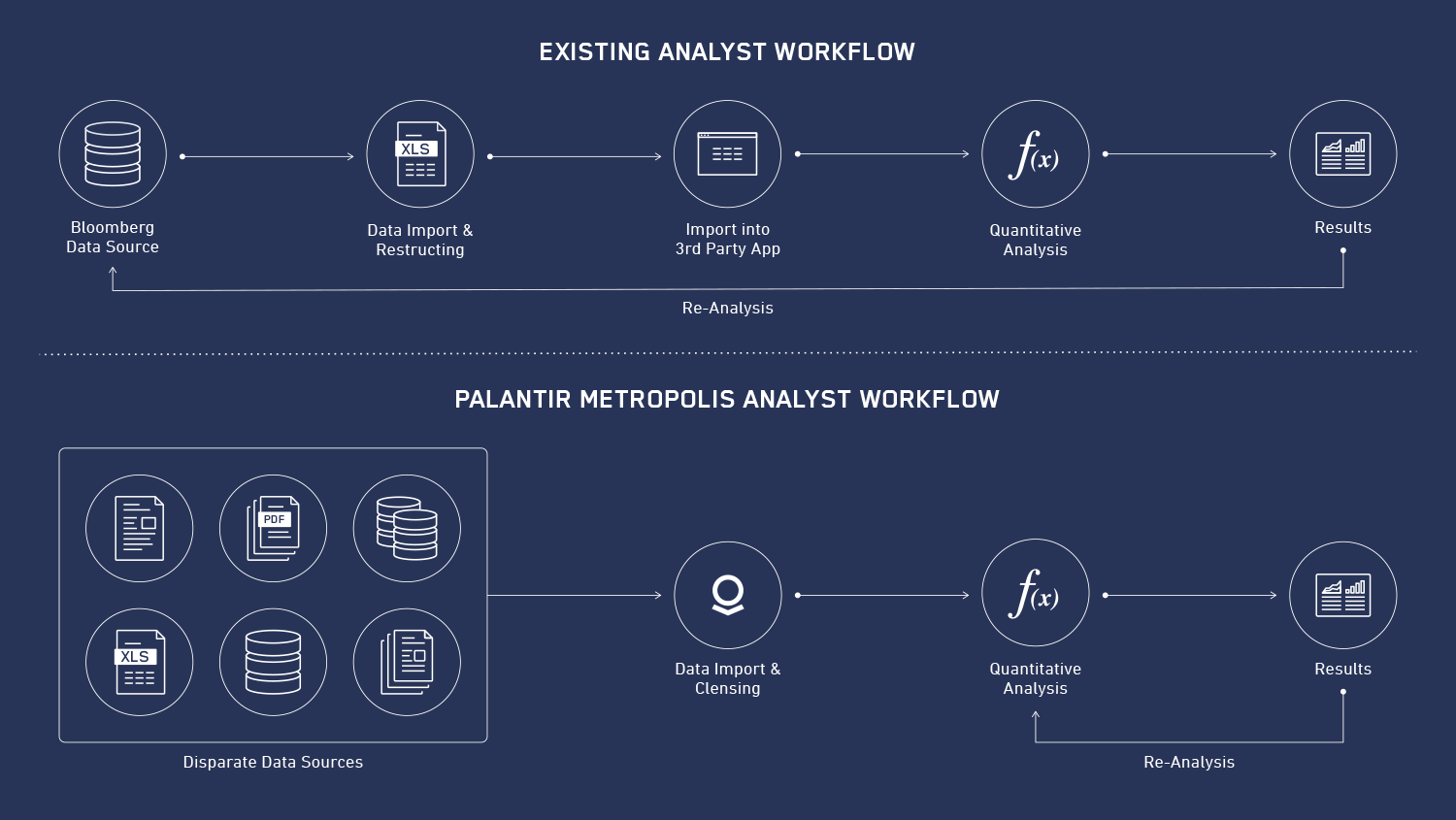
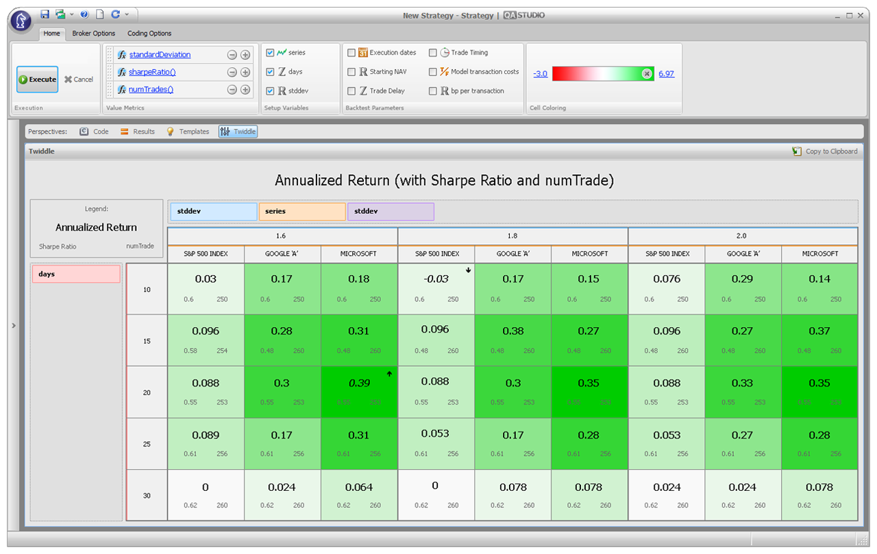
- Financial Analysts: A trader comes up with a market thesis involving a class of equities and specific date sets. A team of quants translate the thesis into equations, while pulling the needed datasets from Bloomberg into an Excel spreadsheet. The data is imported into software like FactSet or MatLab and back-tested against past performance to see if the thesis would likely yield the desired results. If a change is requested, the team must go back and pull new data, and repeat the process. This could take days. Reports and presentations are created using charts from various software packages.
- Academic Analysts: Academic researchers similarly create hypotheses on economic data, which could also be correlated with non-standard data. Similarly, they often need to import and export data into disjointed software applications. They can then back test their theories against historical data to see their answers. Once done, they create reports and publications using charts from various applications.
- Executives: Executives look for a broader/macro view of the markets and their team’s positions. This is expressed as dashboards, Powerpoint presentations, or PDF reports.
Over the course of our development, we received various forms of feedback from CEOs to the analysts that used our product. We also had a growing number of internal users called Forward Deployed Engineers, who often worked onsite with clients. These members were on the ground floor with clients and were able to provide instant feedback on features and changes cutting our feedback cycle down.
Prototypes
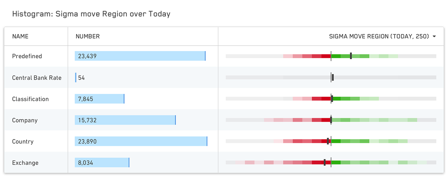
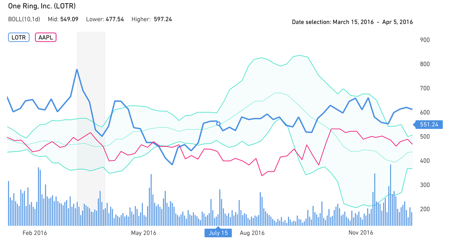
Guided by our founders, from principles they learned while solving the fraud problem for PayPal, we took an approach using human-computer symbiosis (vs. AI) to build a platform that could help an average person perform better than a machine or a trained elite human. We wanted the computers to do the jobs that they were best at (processing at scale, sorting, crunching numbers, visualization, etc.), and the humans to do what they were best at (making decisions, ruling out anomalies, understanding exceptions, analyzing and hypothesizing, etc.). In trying to create a new user workflow that would encompass the needs of the users in our research, we had to build a suite of tools that could import large scales of structured and unstructured data (anything from world equity markets data to weather data, to press releases, etc.; we even tried correlations with baseball stats for fun.), cleanse the data, manipulate it with a user-friendly interface, and then visualize it in an elegant way.
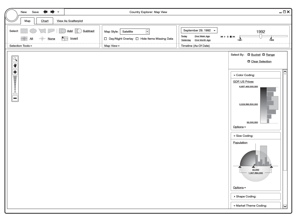
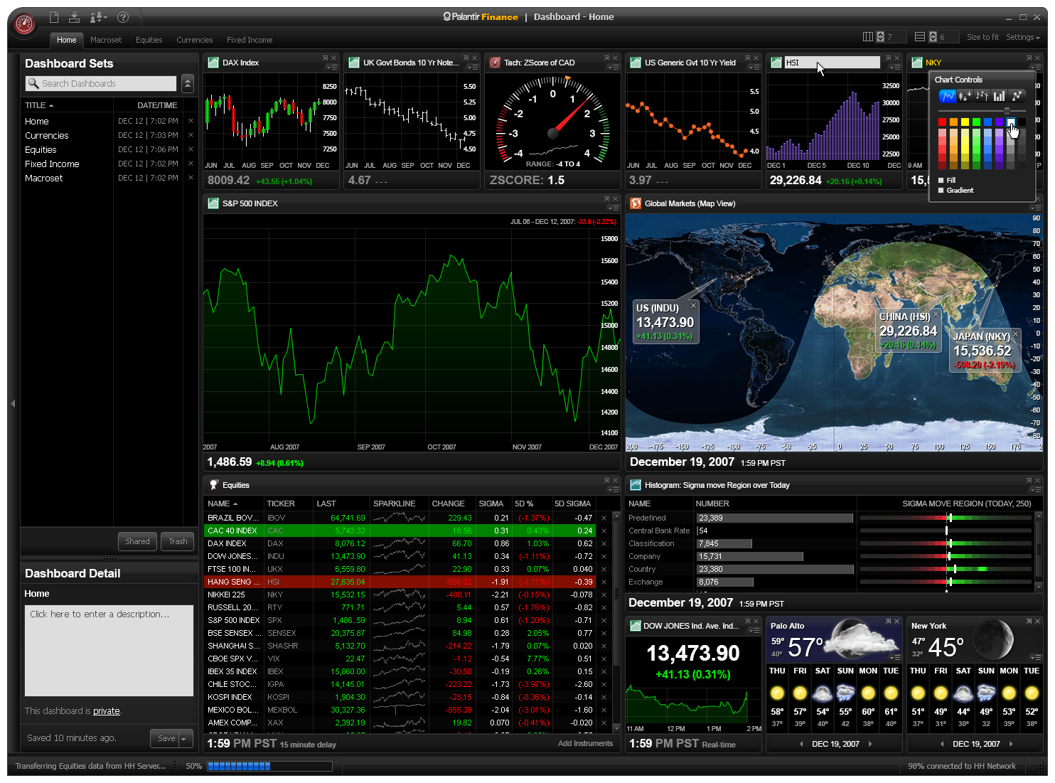
Due to the complexity and expansiveness of where this product could go, we modularized component pieces into various processing and visualization applications such as an [Financial] Instrument Explorer, Country Explorer, Chart, Date Set, etc. The overall structure of the product would be similar to a suite of interacting applications like Microsoft’s Office Suite, or Adobe’s Creative Suite, where we could work on one application, then add others as we learned of newer workflows and needs. Because all our users were familiar with and used Excel in their day-to-day workflow, we used that context for the beginnings of our user experience.
Design & Iteration
To use a contextual metaphor for easing our users into a completely new system, we played to a form factor similar to an OS system with a taskbar to launch applications, and a UI that Excel/Bloomberg users could understand quickly. We utilized the tab/ribbon UI that Microsoft implemented in their latest version of Office (remember, this was 2007); as well as had a console-like command line UI which allowed more seasoned analysts to perform functions and equations.
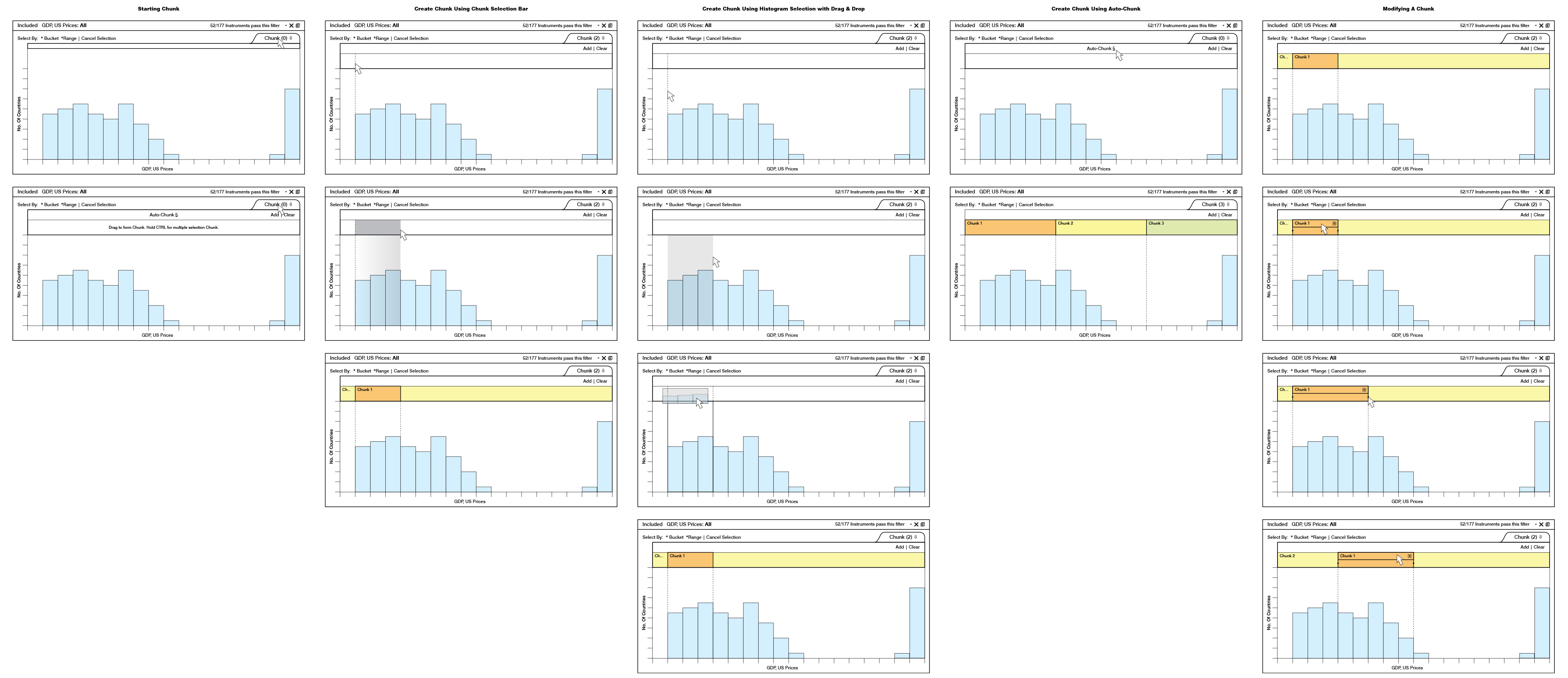
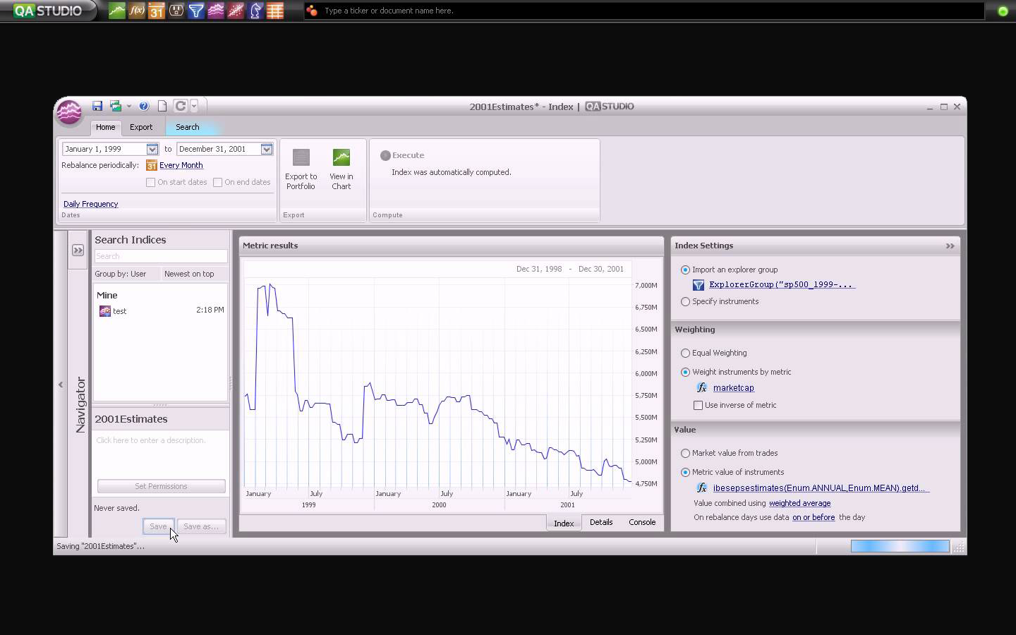
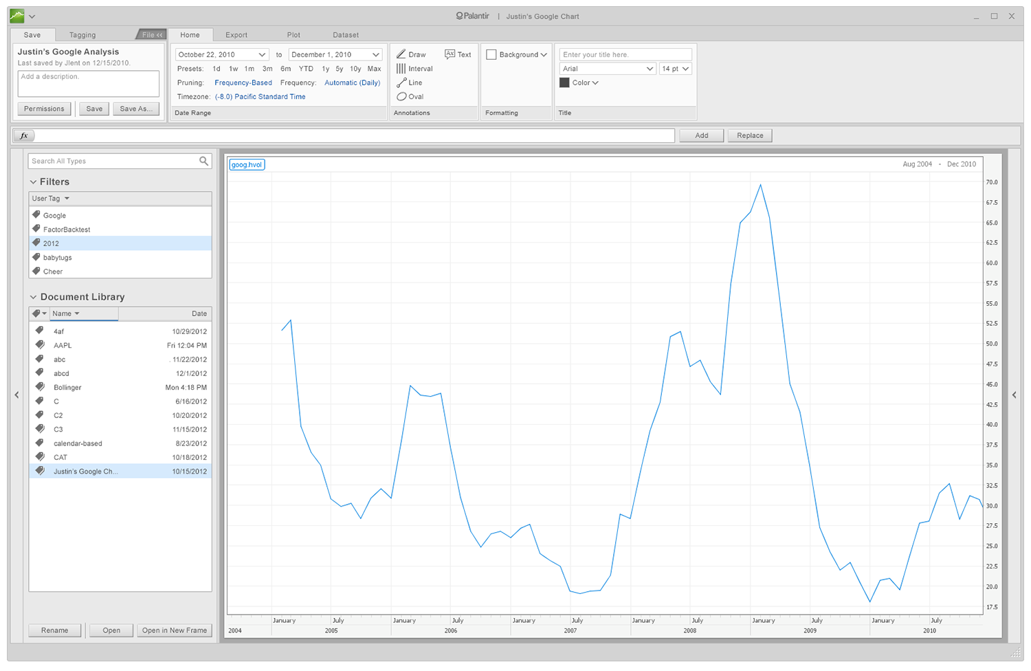
Each app could save object-oriented data sets for use in other apps. For example, a Date Set such as ‘every Every Election year’ could be used in the Chart application to view how equities perform during election years versus other years.
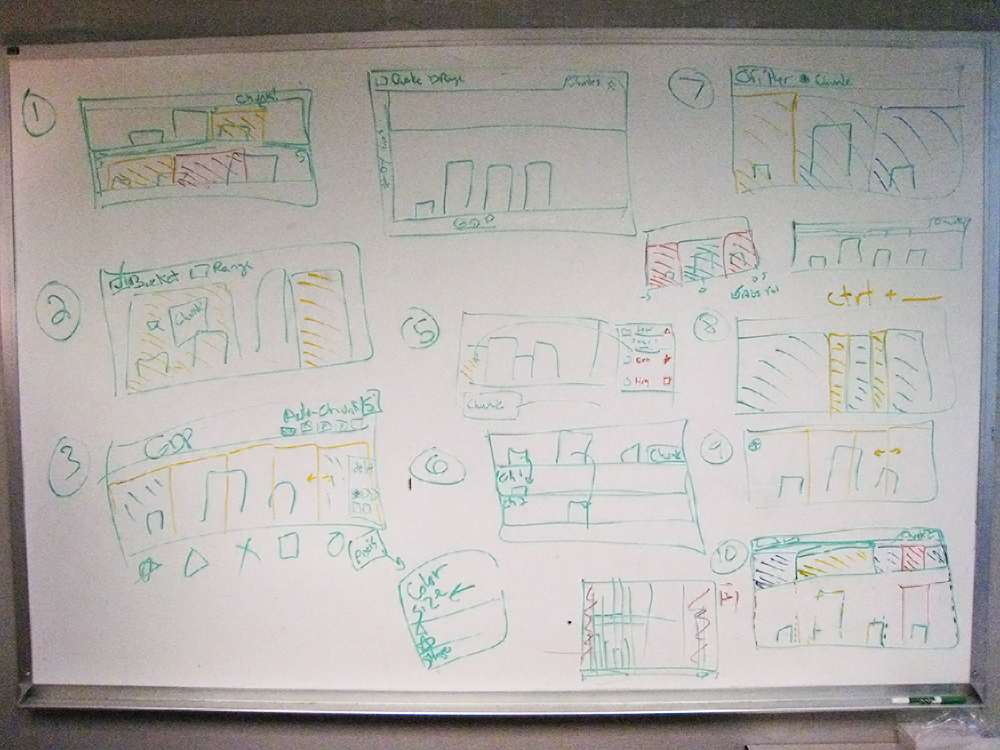
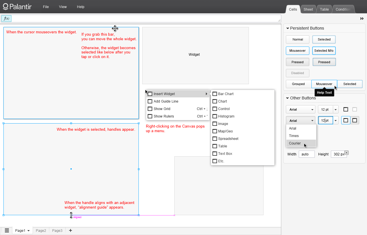
Due to the scale of this endeavor, I focused on wireframing the user interfaces, creating the visual language of the UI, UX workflows of specific features, and visualizations. Over time, we had a functioning product suite with over 7 major applications. Our V1 went out to a partner hedge fund and more feedback was gathered which constantly drove changes and revisions.
Some of the major challenges I had were to create unique icons that represent financial interactions (and at 16 x 16 pixels), create a visual language and style that resonated with the users. This often meant adding some “shine” to the chroma and dashboards, especially for the executive users. I tried to adhere to standards set by Edward Tufte for the data visualizations, by reducing the unnecessary elements in the content regions, while allowing for user manipulation via inline contextual interfaces. I also had to work on complex and esoteric financial concepts and help create clean and friendly workflows within features. I was able to achieve parts of these challenges myself by creating prototype designs then testing them with our users. In other cases, I was able to “skin” our product so the visuals would appeal to the different sets of users we had.
Results & Response
Metropolis achieved a major milestone for Palantir with a groundbreaking deal with Thomson Reuters (the largest at the time), justifying our intentions and execution on our product’s vision. A white label version of Palantir Metropolis called QA (Quantitative Analysis) Studio, which eliminated the complex workflow needed previously, was rolled out to TR’s partners. Metropolis also became the system of record for top hedge funds as it could help back-test unconventional market theories for all levels of analysts. Metropolis also helped diversify Palantir’s client base from a predominantly government one to a one which eventually had a mix of over 50% commercial clients. It also helped open the door toward a new vision for Palantir’s products as it eventually was needed in conjunction with Gotham for newer client workflows.
Reflection and Next Steps
Over the course of working on Metropolis, I’ve learned many things. Design isn’t something created in a vacuum, and in technology it’s constantly evolving. Consider the times as Metropolis was being built. We were at a new peak in the real estate and stock market since the last dot com crash. The iPhone hadn’t been released yet. The majority of monitors had a screen resolution of 1024 x 768 pixels and under; and web technologies weren’t secure for our needs, nor were they capable of allowing the type of interactions and functionality that we needed. This guided our decisions to build our product as a desktop clients using Java. I made the decision to appeal to the different users we had by adding multiple “skins” - a light gray/white version for analysts, and a black version for executives who as our research described wanted “the shiny new thing.” This also allowed for flexibility to change the look and feel in the future as we obtained different types of users. As we got to a stage where we had a minimally functioning product, Lehman Brothers went under and the financial collapse began. Our potential target client based was reduced drastically as everyone was in a state of emergency and putting a halt on their spending, especially on new systems that were unproven.
Over time, many things changed and inevitably if you want to keep up with the context of the times, you have to apply change to your product and design. Technologies were rapidly changing: screen sizes grew, as well as multiplied in format and form factor (iPhones, iPads, touchscreens, etc.). Flat design became the trend and more and more interactions were possible in a browser. The industries we were working in dramatically changed in 2008-2009. New regulations were put in place and new problems, not just in finance became more and more apparent, making the need for our data tools in all aspects of life. Palantir’s focus slowly shifted as our mission was redefined towards broadly using data analysis for making an outsized impact to solve the world’s hardest problems. Instead of working with wealth managers and hedge funds, we began working with banks to help sort out mortgage loan defaults, as well as predatory lending. We needed new workflows for realtors, and bank analysts to stop foreclosures and help people that were underwater in their loans. By 2012, we needed to move to a cloud-based platform and an even more componentized system as these changes began to outpace our ability to update workflows to the existing design. There was a broader scope of need for these data analysis tools. As Palantir began to transform toward this vision, I helped prototype generalized web versions of our components to be used in various industry-agnostic workflows. Today Palantir works with a huge range of entities in government, philanthropy, and the commercial industry all across the board. As a designer in these times, I’ve learned that having a vision of future needs and changes, as well as questioning the norm, constant revision, and testing, are necessities to to building a successful product.